Parameters

These parameters configure various things such as the relative location of data files, which date is being analysed and the assumed generation period for an infection.

Data Preparation

Currently, we parse tne contents of https://www.health.nsw.gov.au/news/Pages/2022-nsw-health.aspx and then for each date with a statistics HTML we populate a per-date cache by downloading the page NSW health if required or using a previously downloaded page if it is exists. We then parse each of these to obtain the "total" and "cumulative_corrected" statistics for each date. We calculate "cumulative" as the cumulative sum of total and "correction" as the difference between "cumulative_corrected" and "cumulative".

Next, we truncate and refindex the data frames to each outbreak.

Growth Model

If the model was perfect, tbe following would be true:

$ \space\space\space\space\space\text{cumulative}_{t+1} = (1+\frac{\text{g}_t}{100})\times\text{cumulative}_t $

In practice, the growth rate, $g_t$, is estimated by fitting a linear regession through a set of points:

$ \space\space\space\space\space(t-k, \ln{(\text{cumulative}_{t-k})}) $

for k = 0..4. This yields parameters of a linear reqregssion:

$ \space\space\space\space\space\ln(\text{cumulative}_t) = m \times t + b $

Raisng e to each side, yields:

$ \space\space\space\space\space\text{cumulative}_t = (e^m)^t \times e^b = e^m \times (e^m)^{t-1} \times e^b = e^m \times \text{cumulative}_{t-1} $

The growth rate, $g_t$, is thus:

$ \space\space\space\space\space g_t = (e^m-1) * 100 $

The minimum growth rate $g_{t,min}$ is defined as:

$ \space\space\space\space\space g_{t,min} = min(\{k: 0 \le k < 5: g_{t-k}\}) $

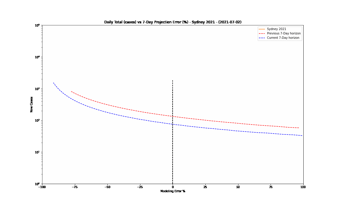
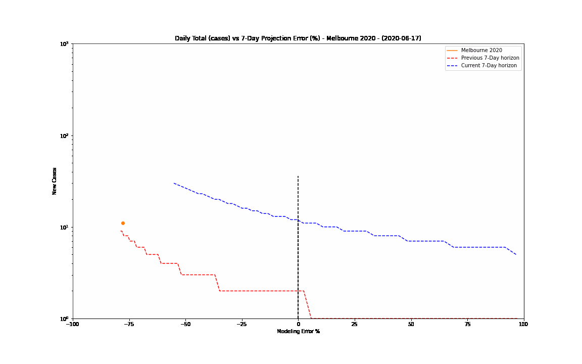
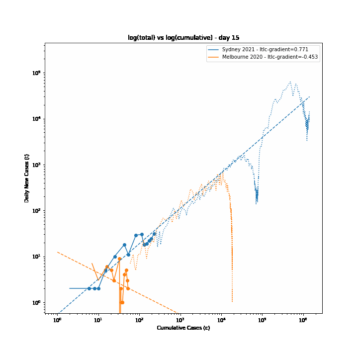
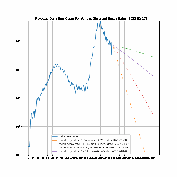
The 7-day forward projection of the cumulative total, $projection_t$ used on the so-called "hedgehog plot" uses $g_{t,min}$ since this was observed to provide closest fit to the Melbourne 2020 outbreak, particularly in the later stages.

$ \space\space\space\space\space \text{projection}_t = (1+\frac{g_{t-7,min}}{100})^7 \times \text{cumulative}_{t-7} $

The intuitive justification is that because the growth rate eventually starts to decay, a fit to the last 5 days growth is going to tend overestimate the growth in the next 5 days so choosing the minimum observed growth rate estimate is more likely to be closer to true growth rate rather than the very latest estimate.

The replication factor, $R_{eff}$ is defined as:

$ \space\space\space\space\space R_{eff} = (1+\frac{g_t}{100})^5 $

The doubling period, in days, is defined as:

$ \space\space\space\space\space \text{doubling period}_t = \ln{(2)}/\ln{(1+\frac{g_t}{100})} $

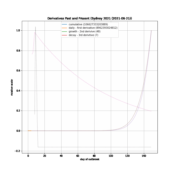
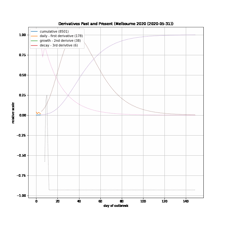
The table below documents various calculated parameters.

7 Day Model

This section presents the 7-day old, 7-day forward projection, e.g. the prediction for the current date and a comparison with what actually happened. This is about measuring the effectiveness for a 7-day model for a known period. In particular, we are not trying to predict what will happen in the next 7 days/

1-day Projections (Past and Present)

Cumulative Plot (Partial)

Growth Plot

This plot shows the estimated and projected daily cumulative growth rate as a percentage. By definition, the cumulative growth rate is always an (eventually small) non-negative value. The values plotted for each outbreak are $g_t$ and $g'_t$ as calculated above.

Growth Projection Relative Error Plot

This plot display the relative error between the projected 7-day cumulative growth and the growth that occurred in practice.

The relative error is defined as:

$ \space\space\space\text{error}_t = \text{projection}_t - \text{cumulative}_t $

$ \space\space\space\text{relative error}_t = \frac{\text{projection}_t - \text{cumulative}_t}{\text{cumulative}_t - \text{cumulative}_{t-7}} \times 100 $

Reff

Sydney Decay Rate Model

The decay rate estimates are calculated by takimg the Nth root of the ratio between two growth rate estimates taken on dates N days apart.

Melbourne 2020 Decay Rate Model

Daily Cases

Comparison of Actual Daily Total to (retrospective) Reff-based Forecast

Comparison of Rolling Average of Actual Daily Total to Rolling Average of (retrospective) Reff-based forecast

New Cases Projections

caution: These projections need to be taken with a large grain of salt.

Methodology

We calculate a set of curves that estimate the growth decay rate.

We do this by taking the ratio of growth rate estimates for days separated by a period of n days for n=7..28, and then, assuming the change is due to exponential decay, take the nth root of that ratio to produce a daily growth decay factor estimate which is then converted into a rate estmate - the growth decay rate estimate.

We then take a weighted average of all such curves to produce a single curve which represents the weighted average estimate of the growth decay rate as a function of time. The weight for each curve is period n, so the curve is naturally weighted towards the longer period estimates. This seems reasonable, because the weighted average estimate falls within the bounds of the individual period based estimates.

Then, we calculate 4 statistics from that curve: min, max, mean and last.

Finally, we project the cumulative growth into the future using these 4 growth decay rate estimates to progressively update the growth rate.

It is expected that the last and mean statistics will converge over time and, if Melbourne 2020 is any guide, 'last' should start to drive beneath 'mean'. Until that happens, it seems safe to assume that the eventual result will be somewhere between the 'last' curve and the 'mean' curves since it seems improbable, at this point, that the growth decay rate will weaken further in the other directon.

Derivation Of Decay Rate

The decay rate is calculated as an exponential fit through growth rates after July 2 (day 15).

Sydney Derivatives

This plots the actual cumulative blue) and daily totals (orange) for the Sydney 2021 outbreak together with the implied daily growth rate (green) and the rate of decay of the growth rate (red</red>).

The dotted extensions of each observed plot are projections into the future assuming a constant (negative) decay rate. This decay rate is based on expoential fit through recent growth rate estimates (see plot above). This assumption is not sound and is likely to underestimate the true decay rate particularly in the later stages of the outbreak. As such peak estimates and timing are indicative only and are likely to be worst-case by a factor of 2 or more.

Concurrent Health Outcomes

The concurrent hospitalised and ICU statistics are the number of beds occupied by COVID-19 cases at the time of the cumulative case observation - it is not the total number of people admitted to hospital or ICU since the beginning of the outbreak. So if, over 7 days, there is a net increase of 1000 cumulative cases and 2 people leave the ICU and 5 people enter the ICU, then there will be a increase in occupancy of 3 people in the ICU - a rate of 3/1000 = 0.3%.

Derivatives Animation

Log Log Plots

The minutephysics YouTube channel popularised the technique of using log-log plots to visualise when exponential growth of daily case totals slows and then reverses.

This section creates static and animated log-log plots. In addition to plotting the log-log curve, we fit trend lines to the last 14 days to better help visualise changes in growth rates. This is most evident in the animated plots.

static log-log plot

log-log gradient vs time

Also, we plot the calculated gradients against time to see how they change with time.

Note: we calculate and plot the gradient of the natural log-log curves not the log base 10 curves.

animated log-log plot

Animated New Cases Projection

Linear Growth

Sydney 2021

Melbourne 2020